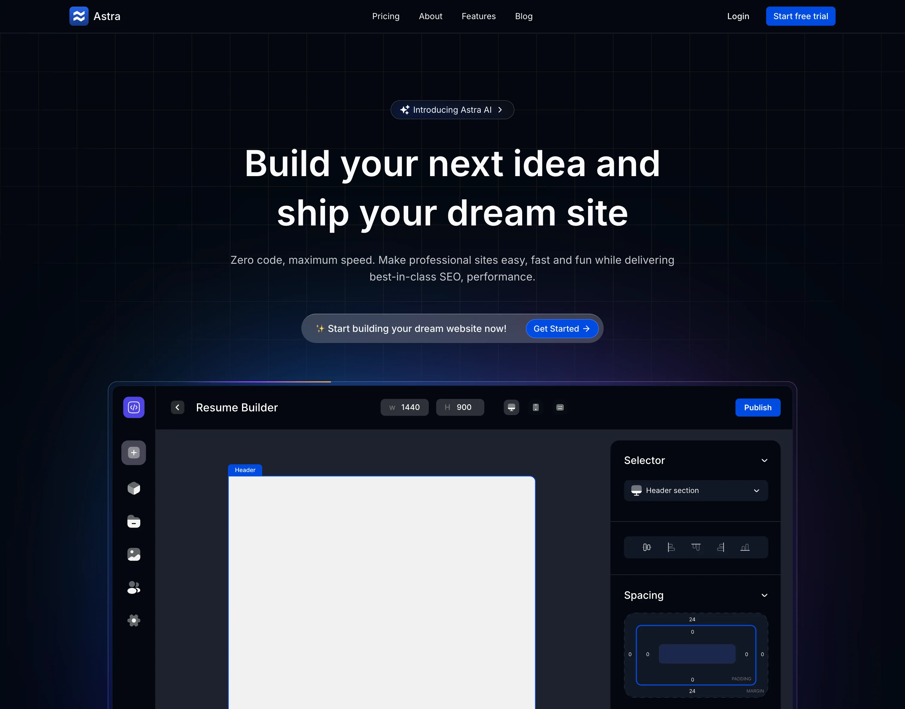
Overview
Astra is a sleek, conversion-focused landing page for a no-code website builder platform. With minimalist design and strategic use of whitespace, it demonstrates how to present complex software in a simple, approachable way. The design emphasizes the product itself through an interactive editor preview and clear value propositions.
Minimalist Excellence
Astra proves that sometimes less is more - with clean design, strategic whitespace, and focus on the product rather than busy graphics.
Page Components
Hero Section
Clear Value Proposition:
- Headline - "Build Beautiful Websites Without Code"
- Subheadline - "Design, launch, and grow your online presence"
- Primary CTA - "Start Building Free"
- Secondary CTA - "Watch Demo Video"
- Trust Indicators - "No coding required • 14-day free trial"
- Visual - Clean editor interface preview
Design Approach:
- Centered layout
- Ample whitespace
- Large, readable typography
- High-contrast CTAs
- Minimal distractions
Product Editor Preview
Interactive Mockup:
- Real editor interface
- Drag-and-drop simulation
- Component library preview
- Property panel showcase
- Responsive preview toggle
- Live editing simulation
Key Features Shown:
- Visual page builder
- Component library
- Style controls
- Responsive views
- Template sections
- Publishing tools
Feature Highlights
Core Capabilities:
-
Drag & Drop Builder
- Intuitive interface
- No learning curve
- Real-time preview
- Undo/redo
- Component library
-
Responsive Design
- Mobile-first
- Tablet optimization
- Desktop layouts
- Custom breakpoints
- Preview all sizes
-
Templates Library
- 100+ templates
- Industry-specific
- Fully customizable
- Regular updates
- One-click import
-
Custom Domains
- Connect your domain
- Free SSL
- DNS management
- Subdomain support
- Email forwarding
-
SEO Tools
- Meta tag editing
- Sitemap generation
- Social sharing
- Analytics integration
- Performance optimization
-
Team Collaboration
- Multi-user editing
- Comments and feedback
- Version history
- Role permissions
- Activity log
Signup Flow
Authentication Pages:
Sign Up Page:
- Email registration form
- Social login options (Google, GitHub)
- Password requirements indicator
- Terms acceptance checkbox
- "Already have an account?" link
- Clean, distraction-free design
Login Page:
- Email and password fields
- "Remember me" checkbox
- "Forgot password?" link
- Social login options
- Minimal, focused design
Onboarding:
- Welcome screen
- Template selection
- Quick tutorial
- First project creation
- Dashboard tour
Design System
Color Palette
Primary Colors:
--blue-600: #2563eb
--blue-700: #1d4ed8
--blue-50: #eff6ff
--neutral-900: #171717
--neutral-100: #f5f5f5
--neutral-50: #fafafaUsage:
- Blue: Primary actions, links
- Dark: Headlines, important text
- Light: Backgrounds, sections
- White: Cards, modals
Typography
Font: Inter
- Very clean, readable
- Excellent at all sizes
- Professional appearance
Hierarchy:
- Display: 72px / 700 weight
- H1: 56px / 700
- H2: 40px / 600
- H3: 28px / 600
- Body: 18px / 400
- Small: 14px / 400
Line Height:
- Headlines: 1.2
- Body: 1.6
- UI Elements: 1.5
Spacing System
Scale (px):
4, 8, 12, 16, 24, 32, 48, 64, 96, 128Consistent Application:
- Sections: 96px vertical padding
- Cards: 32px padding
- Buttons: 12px 24px
- Grid gaps: 24px
- Element margins: 16px
Component Library
Input Field Design:
border: 1.5px solid #e5e7eb;
border-radius: 8px;
padding: 12px 16px;
font-size: 16px;
background: white;
/* Focus */
border-color: #2563eb;
outline: none;
box-shadow: 0 0 0 3px rgba(37, 99, 235, 0.1);Form Elements:
- Text inputs
- Textareas
- Select dropdowns
- Checkboxes
- Radio buttons
- Toggle switches
Validation:
- Inline error messages
- Success indicators
- Real-time validation
- Clear error states
Card Style:
background: white;
border: 1px solid #e5e7eb;
border-radius: 12px;
padding: 24px;
box-shadow: 0 1px 3px rgba(0, 0, 0, 0.08);
transition: all 0.2s ease;
/* Hover */
border-color: #d1d5db;
box-shadow: 0 4px 12px rgba(0, 0, 0, 0.12);
transform: translateY(-2px);Card Types:
- Feature cards
- Template cards
- Pricing cards
- Testimonial cards
- Blog post cards
Editor Preview Design
Interface Components
Sidebar - Component Library:
- Sections (Headers, Content, Forms, etc.)
- Drag handles
- Component thumbnails
- Search functionality
- Filter by category
Main Canvas:
- Visual editing area
- Drop zones highlighted
- Selected element outline
- Inline editing
- Context menu
Right Panel - Properties:
- Style controls
- Content editing
- Settings options
- Responsive toggles
- Advanced options
Top Toolbar:
- Undo/redo buttons
- Device preview toggle
- Zoom controls
- Save status
- Publish button
Animations
Framer Motion Effects:
Page Load:
<motion.div
initial={{ opacity: 0, y: 20 }}
animate={{ opacity: 1, y: 0 }}
transition={{ duration: 0.5 }}
>Scroll Reveal:
- Features fade in sequentially
- Editor preview slides from side
- Stat counters animate
- Testimonials rotate
Hover States:
- Template cards scale slightly
- Feature icons bounce
- Buttons lift with shadow
- Links underline animate
Micro-interactions:
- Button presses (scale down briefly)
- Toggle switches slide
- Checkboxes check with animation
- Loading spinners spin smoothly
Technology Stack
Next.js 14
- App Router
- Server Components
- Optimized performance
TypeScript
- Full type safety
- Better DX
Tailwind CSS
- Custom design system
- Responsive utilities
- JIT compilation
Shadcn UI
- Form components
- Dialog modals
- Dropdown menus
Framer Motion
- Page transitions
- Scroll animations
- Gesture support
Responsive Behavior
Mobile (< 768px)
Adaptations:
- Single column layout
- Hamburger menu
- Simplified editor preview
- Stacked feature cards
- Bottom sheet CTAs
- Touch-optimized spacing
Tablet (768px - 1024px)
Optimizations:
- Two-column grids
- Collapsible sidebar
- Medium-sized previews
- Adjusted typography
- Hybrid interactions (touch + hover)
Desktop (> 1024px)
Full Experience:
- Multi-column layouts
- Full editor preview
- Rich hover effects
- Side-by-side comparisons
- Expanded navigation
Use Cases
Freelancers
Build client websites quickly:
- Portfolio sites
- Business websites
- Landing pages
- Event pages
- Personal blogs
Small Businesses
Affordable web presence:
- Company websites
- Online stores
- Service pages
- Contact forms
- Team pages
Agencies
Scale production:
- Client projects
- Rapid prototyping
- Template reuse
- Team collaboration
- White label option
Performance
Optimization Techniques:
- Next.js image optimization
- Code splitting
- Lazy loading
- Font optimization
- Static generation
Benchmarks:
- Lighthouse: 95+
- FCP: < 1.0s
- LCP: < 1.5s
- TTI: < 2.0s
- CLS: < 0.05
Getting Started
Explore the Site
Visit astra.naseemkhan.dev to see the clean, minimalist design.
View Editor Preview
Interact with the product mockup to understand the builder interface and capabilities.
Test Signup Flow
Experience the authentication pages:
- Sign up form
- Login page
- Password reset
- Onboarding (simulated)
Adapt the Design
Customize for your product:
- Update branding
- Modify color scheme
- Change editor mockup
- Adjust feature list
- Update copy
Key Design Principles
Clarity Above All
Astra's design philosophy: Clear messaging, minimal distractions, and letting the product speak for itself through an interactive preview.
Minimalism
Less is More:
- Ample whitespace
- Simple layouts
- Limited color palette
- Clear typography
- Focused content
Benefits:
- Faster loading
- Better comprehension
- Reduced overwhelm
- Professional appearance
- Timeless design
Product-Focused
ShowDon't Tell:
- Interactive editor preview
- Real interface mockup
- Actual use cases
- Visual demonstrations
- Minimal marketing speak
Future Enhancements
- Video Tutorials - Product walkthrough videos
- Live Demo - Try the builder without signup
- Template Showcase - Browse all templates
- Customer Stories - Detailed case studies
- Blog Integration - Content marketing
- Knowledge Base - Self-service help
- Community Forum - User discussions
- Marketplace - Third-party add-ons
Experience Minimalist Design
See Astra's clean, focused approach at astra.naseemkhan.dev!
