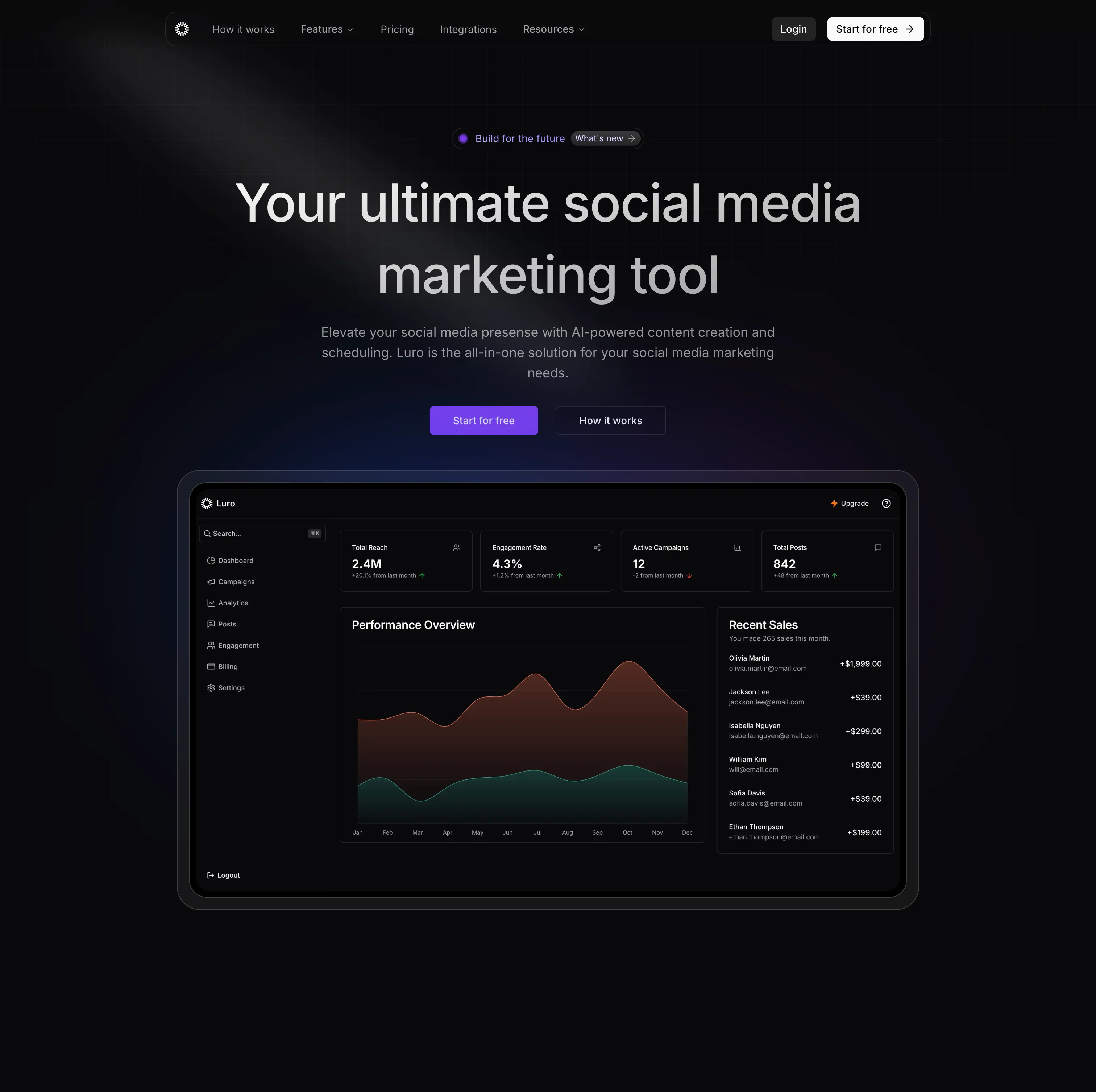
Overview
Luro is a polished SaaS landing page designed for social media campaign management tools. With a focus on clarity and conversion, it presents complex features in an accessible way. The design balances professional aesthetics with user-friendly layouts, making it perfect for marketing and analytics SaaS products.
Campaign Management Focus
Luro excels at presenting campaign analytics and multi-platform management features through intuitive visual design and clear information architecture.
Page Sections
Hero Section
- Compelling Headline - "Manage All Campaigns in One Place"
- Benefit Subheadline - Time-saving value proposition
- Dashboard Preview - Campaign analytics mockup
- Social Proof - User count and trust badges
- Action CTAs - Free trial and live demo
- Platform Badges - Social media integrations
Live Dashboard Preview
- Interactive Mockup - Realistic campaign dashboard
- Real-Time Metrics - Animated statistics
- Performance Charts - Line and bar graphs
- Campaign Cards - Individual campaign previews
- Filter Controls - UI element showcases
- Responsive Design - Scales beautifully
Core Features
- Unified Dashboard - All platforms in one view
- Performance Analytics - Detailed metrics
- Campaign Scheduler - Plan and automate posts
- Team Collaboration - Multi-user workflows
- Budget Tracking - ROI and spend analysis
- Custom Reports - Exportable insights
Integration Section
- Platform Logos - Facebook, Instagram, Twitter, LinkedIn, TikTok
- Connected View - Visual connection lines
- API Documentation - Developer resources link
- More Integrations - "50+ platforms supported"
- Webhook Support - Real-time data sync
Pricing Comparison
- Three Plans - Solo, Team, Agency
- Feature Matrix - Clear comparison table
- Highlighted Plan - Team plan featured
- Transparent Pricing - No hidden fees
- FAQ Link - Common questions addressed
Design System
Color Palette
Primary Colors:
--purple-600: #9333ea
--purple-700: #7e22ce
--neutral-900: #171717
--neutral-50: #fafafa
--blue-500: #3b82f6Usage:
- Purple for primary actions
- Dark for text and headings
- Light backgrounds
- Blue for secondary actions
- Green for success states
Typography
Font Stack:
- Headings: Inter Bold (700)
- Body: Inter Regular (400)
- UI Elements: Inter Medium (500)
Scale:
- H1: 60px → 36px (mobile)
- H2: 48px → 32px (mobile)
- H3: 32px → 24px (mobile)
- Body: 18px → 16px (mobile)
Component Library
Buttons:
- Primary: Purple gradient, white text
- Secondary: Border, purple text
- Ghost: Transparent, subtle hover
Cards:
- White background
- Subtle shadow
- Border radius: 12px
- Hover: Lift effect
Input Fields:
- Light gray background
- Focus: Purple border
- Error: Red border
- Success: Green checkmark
Animations
Framer Motion Effects:
// Fade in from below
initial={{ opacity: 0, y: 30 }}
whileInView={{ opacity: 1, y: 0 }}
transition={{ duration: 0.5 }}
// Stagger children
variants={{
container: {
staggerChildren: 0.1
}
}}Scroll Triggers:
- Features fade in sequentially
- Dashboard slides in from side
- Pricing cards scale up
- Testimonials rotate in
Interactive Mockup:
- Hover: Cards lift slightly
- Click: Modal opens (simulated)
- Numbers: Count up animation
- Charts: Draw in animation
- Loading: Skeleton screens
Real-Time Simulation:
- Metrics update periodically
- New notifications appear
- Progress bars animate
- Status indicators pulse
Page Elements:
- Smooth color transitions
- Opacity fades
- Transform animations
- Easing:
cubic-bezier - Duration: 300-600ms
Mobile Interactions:
- Menu slide in/out
- Accordion expand/collapse
- Tab switching
- Modal overlays
Technology Stack
Next.js - React meta-framework
- App Router architecture
- Server Components
- Image optimization
- Fast performance
TypeScript - Type safety
Tailwind CSS - Utility-first styling
- Custom purple theme
- Responsive utilities
- Custom components
Shadcn UI - Component primitives
Framer Motion - Smooth animations
- Scroll-triggered effects
- Hover interactions
- Page transitions
Dashboard Mockup
Design Highlights
Navigation:
- Sidebar with icons
- Top bar with search
- User profile menu
- Notification bell
Main Content:
- Campaign list view
- Performance cards
- Analytics charts
- Quick actions
Data Visualization:
- Line charts (engagement over time)
- Pie charts (platform distribution)
- Bar charts (campaign comparison)
- Stat cards (key metrics)
Interactive Elements:
- Filterable campaigns
- Sortable columns
- Expandable details
- Hover tooltips
Responsive Breakpoints
Mobile (< 768px):
- Single column layout
- Hamburger menu
- Stacked cards
- Simplified dashboard
- Touch-optimized
Tablet (768px - 1024px):
- Two-column grid
- Collapsible sidebar
- Medium dashboard preview
- Touch and hover support
Desktop (> 1024px):
- Three-column grid
- Full sidebar
- Large dashboard mockup
- Rich hover effects
- Parallax elements
Use Cases
Marketing Agencies
Perfect for:
- Multi-client campaign management
- Social media scheduling
- Performance reporting
- Team collaboration
- Budget oversight
In-House Marketing Teams
Ideal for:
- Brand consistency
- Campaign coordination
- Analytics tracking
- Content calendar
- ROI measurement
Freelance Marketers
Great for:
- Client management
- Post scheduling
- Performance reports
- Time tracking
- Invoice generation
Conversion Elements
Trust Builders
- Social Proof - "10,000+ marketers trust us"
- Client Logos - Recognizable brands
- Testimonials - 5-star reviews
- Case Studies - Success stories
- Security Badges - GDPR, SOC 2
Risk Reducers
- Free Trial - 14 days, no credit card
- Money-Back Guarantee - 30 days
- Flexible Plans - Monthly or annual
- Cancel Anytime - No contracts
- Setup Support - Free onboarding
Clear Value Props
- Time Savings - "Save 10 hours/week"
- Cost Efficiency - "Reduce ad spend by 30%"
- Simplicity - "Manage everything in one place"
- Insights - "Make data-driven decisions"
- Growth - "Grow your audience faster"
Getting Started
View Demo
Visit luro.naseemkhan.dev to see the complete landing page with animations.
Explore Dashboard
Check out the dashboard mockup:
- Campaign cards
- Analytics charts
- Performance metrics
- UI interactions
Customize Design
Adapt for your product:
- Change color scheme
- Update dashboard mockup
- Modify features list
- Replace platform logos
- Adjust pricing tiers
Key Takeaways
Design Excellence
Luro demonstrates how to present complex SaaS features clearly with intuitive visual hierarchy, engaging mockups, and conversion-focused design.
What Works Well
Visual Hierarchy:
- Clear section separation
- Strategic use of whitespace
- Color-coded information
- Size-based importance
Information Architecture:
- Logical flow from problem to solution
- Features before pricing
- Social proof throughout
- CTAs at natural decision points
Engagement:
- Interactive dashboard preview
- Animated elements
- Hover effects
- Scroll-triggered animations
Performance
Optimization
Images:
- WebP format
- Responsive sizes
- Lazy loading
- Optimized dashboard images
Code:
- Code splitting
- Tree shaking
- Minification
- Gzip compression
Metrics:
- LCP: < 2.0s
- FID: < 100ms
- CLS: < 0.1
- Lighthouse: 90+
Customization Tips
Quick Updates
Colors:
// tailwind.config.ts
theme: {
colors: {
primary: '#9333ea', // Your brand color
secondary: '#3b82f6',
}
}Content:
- Hero headline
- Feature descriptions
- Pricing details
- Testimonials
- Integration logos
Layout:
- Section order
- Grid columns
- Card layouts
- Dashboard position
Advanced Changes
Dashboard Mockup:
- Replace with your UI
- Update metrics
- Change charts
- Modify colors
- Add interactions
Animations:
- Timing adjustments
- Easing functions
- Trigger points
- Hover effects
Future Ideas
- Video Demo - Product walkthrough
- Live Dashboard - Working demo
- Blog Section - Marketing tips
- Webinar Section - Educational content
- Partner Program - Affiliate links
- Mobile App Promotion - iOS/Android
- Customer Success - Help center
- API Documentation - Developer portal
Discover Luro
Experience the clean design and intuitive flow at luro.naseemkhan.dev!
